Warp'd Space - Cover Artwork
A selection of cover artwork for the Warp'd Space audio drama podcast from .

by Brett Coulstock. .
Around about I had gotten a little fed up with my job as a web-designer, which was creative in some ways, but often tended to either be conservative/unexciting, or ambitious/cluster-headache.
So to stretch my creative muscles I decided to do some side projects. I'm a long-time fan of audio-drama and, after surveying the field of DIY podcast audio-drama I approached writer, producer and actor Julie Hoverson, who created the anthology show 19 Nocturne Boulevard and wound up creating cover artwork for a decent run, and also some of her other shows.
In Julie asked me if I’d consider doing a logo for a friend of hers that she was mentoring — Kimberley — who was writing audio drama: Warp’d Space which is in the tradition of thoughtful character based science-fiction/space-opera such as Star Trek.
I wasn't very well briefed. The impression was that the show was space-opera comedy, hence the jaunty tilt of the logotype. Kimberley liked it though, and I thought about changing it before realising it worked either way.
Earlier in the year I’d decided I wanted to model a spaceship in the style of Chris Foss, Peter Elson, Angus McKie etc. using Blender 3D, so I decided to combine the two goals and said “yes” when asked to do the covers.
Warp'd Space Episode 01
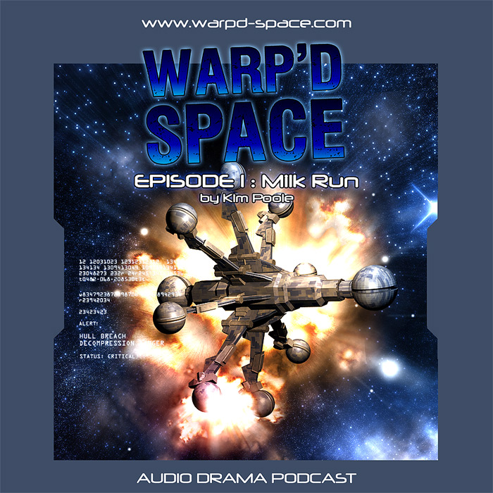
It was important to not just come up with a logo and space ship, but a design, a consistent visual identity.
To this day, album and podcast artwork is square, echoing the CD and its older sibling the Vinyl album. The broad margin was to give a consistent, easily identifiable “shape” to the covers. The left and right cut-outs deliberately echo the bulk-head doors on utilitarian space-ships such as The Nostromo. Originally, I made the margin white, which was quite striking, but I realised if placed on a white-background then it would lose some definition. The desaturated blue means the area of the artwork is clearly delineated against either a white or black background.
I was also aware I was doing regular covers for Julie, and limiting the space available would necessarily limit the complexity of the artwork to something I could deliver in-between other jobs.
The tilted logo actually added a little visual flair for a design that was otherwise quite rigid and angular.
Kimberly described the ship The Drake as being like a “jumping jack”, and indeed my original cover layout had an image of a jumping-jack as a placeholder. Then I began re-learning how to use Blender, and we went through several iterations of the design and arrived with the above.
Looking at it today I detect perhaps a little influence of Discovery and The Liberator but I'm happy with it, and it feels original.
The ship isn’t (and never was) “finished” as such due to my inexperience with Blender, and my failure to properly learn or intuit 3D-modelling. But it was never for high-resolution or print, and I was working on this between other covers, my day job, and my life, so it was “good enough”.
I intended to remodel it, but as with many things, it never happened. In particular, it was a source of disappointment that I never learned how to add greebles to it.
Warp'd Space Episode 05
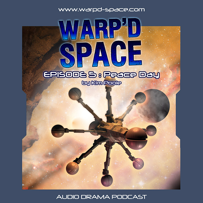
Image Attributions
- Planet
-
Waxing Gibbous Moon 69 Percent 26Nov2009
© Copyright mikebaird / Mike Baird.
Used under license: CC-BY - Asteroid Surface
-
Camelback Mountain from Northeasterly – a view destined to vanish
© Copyright Al_HikesAZ .
Used under license: CC-BY-NC - Stars
- Star-Forming Region LH 95 in the Large Magellanic Cloud from Hubblesite
Credit to: NASA, ESA, and the Hubble Heritage Team (STScI/AURA)-ESA/Hubble Collaboration
Acknowledgment: D. Gouliermis (Max Planck Institute for Astronomy, Heidelberg)
Used under license: Public Domain - Nebula
- A Perfect Storm of Turbulent Gases in the Omega/Swan Nebula (M17) from Hubblesite
Credit to: NASA, ESA and J. Hester (ASU)
Used under license: Public Domain
This is my favourite cover of the series.
I'd been supplied — after much pleading — with some photos of the cast, and while these feature on a number of previous covers, I generally avoided using them. They were just banal photos, not in character or shot in a way that would have made working with them easier, nor were the images particularly high resolution. In one of the photos the actor was wearing a suit and fedora, requiring some digital re-costuming!
Unfortunately, there just didn't seem to be the will to make it work with the actors, and I just fell-back to using the ship as the central focus and took the opportunity to experiment with mood and colour, and found that this approach was creatively satisfying to me at least.
This artwork was heavily inspired by the beautiful speculative and fantastic images of space travel found in the Terran Trade Authority Handbooks, which in retrospect, was probably the first art books I ever owned. In particular, the rendering of a space scene in very light colours, away from the traditional blue/blacks. I started out with yellows which became a lovely peach.
Warp'd Space Episode 06
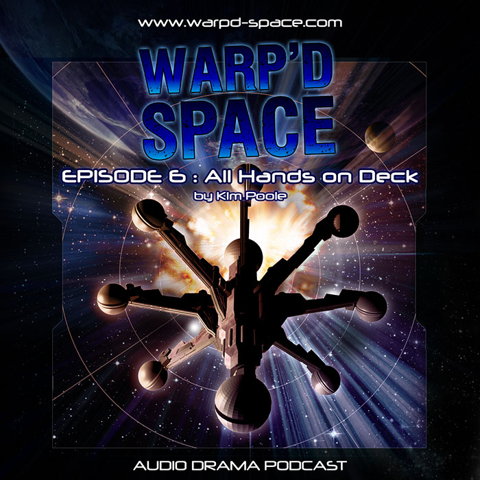
In contrast with the previous episode Peace Day, All Hands on Deck was full of drama.
I don't remember much about this one, other than I did a lot of recycling. The star-field, planet and explosion are all reworked versions of elements from previous covers; it just required a new angle of The Drake.
Previous to this one I'd used a flat, consistent colour for the margins, but from this point on I decided to make it semi-transparent so more of the cover artwork could be seen through it.
Warp'd Space Episode 08
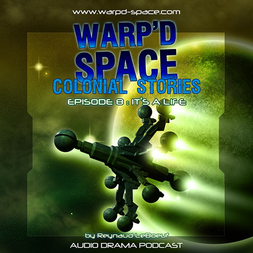
Another Terran Trade Authority inspired cover, this time in green.
I no longer have a high resolution version of this one, which is a shame, because I quite like it. It was another attempt at something vaguely like the Terran Trade Authority illustrations.
And here we see something that happens once a design is set: someone wants a subtitle, so I had to lose more space for the artwork. One of the changes I made for aesthetic reasons was to move the author credit to the bottom. I found leaving it at the top created a weird stack of centred text that seemed to be stamping-down on the art.
And here the series seems to have ended. I do not believe any more episodes were released; and likely I had reached a point where I didn't have time to do more covers.
Warp'd Stories
Licensing and Attributions
I used a number of Creative Commons licensed photographic elements, and here’s the attributions:
- Book
- Open book © Copyright Honou Used under license: CC-BY
- Paper Texture
- Aged paper texture © Copyright ~Essence of a Dream~. Used under license: CC-BY
- Star Chart
-
Chart 1: DeclinationNorth of + 65°
© Copyright The Mag-7 Star Atlas Project / Andrew L. Johnson. Used under license: CC-BY-NC
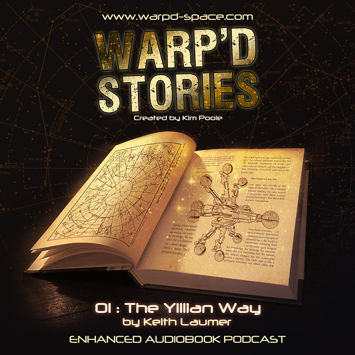
Another request was for what I understood to be a spin-off called Warp'd Stories, dramatised short-stories set in the Warp’d Space universe. Hence the illustration of The Drake and the similar logotype.
Except it wasn't. I later learned that the stories would be general science-fiction tales.
Now, the cover supports that, and using The Drake saved me making a whole new space-ship.
However, if I had known the intent, I would have taken a lot more care to differentiate the two ranges. I do like the overall warmer tone, and I think the juxtaposition of the traditional feel of the book, paper, wood and star-charts with the modern typeface works well.
And for all the work I put into it, the range released only two stories.
But, on reflection, I enjoyed the work and when you work for and with other people, they can help you learn and grow by asking you for things you've never done before, and give you problems that require creative solutions.
It was fun while it lasted!